The demand module in one screen
A walk through the Demand Workbench: the worklist, a verdict the engines read, a number that explains itself, a refused driver, and the contest’s winner.


Most planning tools scatter the judgement across screens and put a batch job between the judgement and the plan. The Demand Workbench is our answer to that: one surface, three panes, and a set of verbs the engines actually read. Here is the walk, in the order a planner takes it on a Tuesday morning.
The worklist, and one gesture
The left pane is the worklist. It ranks the series that need a decision, worst first, and says why each one is there: a spike the cleansing pass flagged, or a bias that has persisted. Select one and the centre pane shows its history and forecast on one canvas, with the outlier band lit where the cleansing engine had an opinion.
The right pane is the rail, and it is the part that matters. A planner does not fill in a form to tell the system what they think. They say keep, correct, mask, declare an event, adjust or approve, one gesture, with the evidence beside it. The verdict is not a note on the side. It lands as data on the history itself, through the same governed path every other number takes, with a reason and a date stamp. The cleansing engine reads it. The model contest reads it. The next cycle reads it. Judgement stops being an override the system fights and becomes an input the system uses.
Every number can be asked why
Right-click any forecast cell and ask what built it.
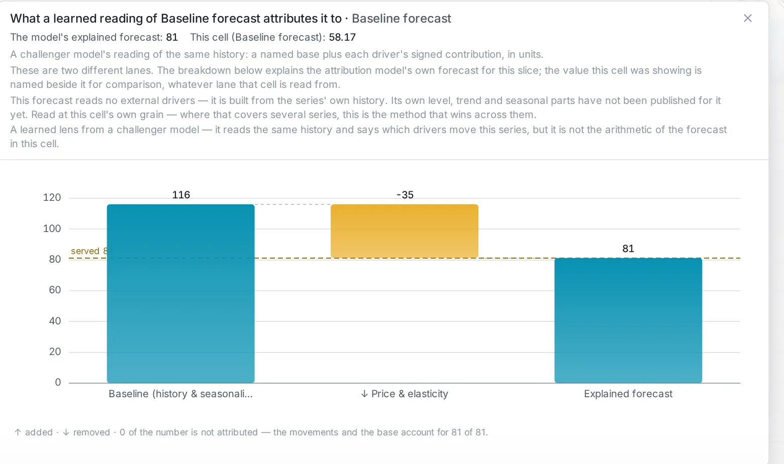
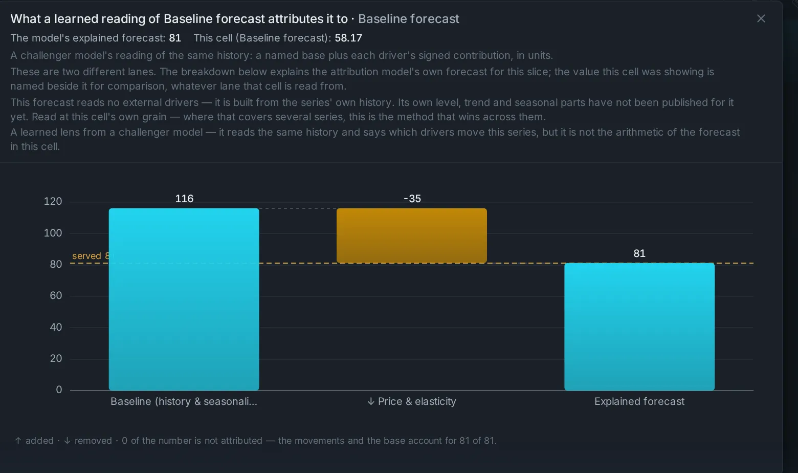
The answer is of the number you clicked, always: the base level, each driver’s push up or down, the model that won and the margin it won by, and what changed since the last cycle. Where the arithmetic is exact, we draw the waterfall. Where a number is a proportional share of something larger, we say so in words instead of drawing a waterfall that would lie. That distinction is built in, and it is the reason a planner can take the explanation into a meeting.
The driver that was refused
A dashboard that always finds a story is not evidence. So every driver a planner switches on (weather, price, promotion, events) is backtested against the series it claims to explain, and the page says, in words, whether it earned its seat.
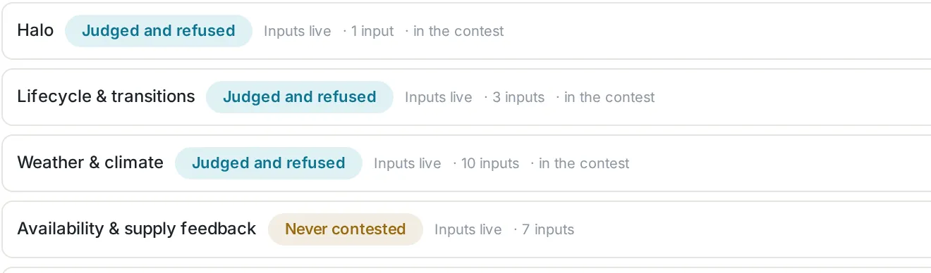
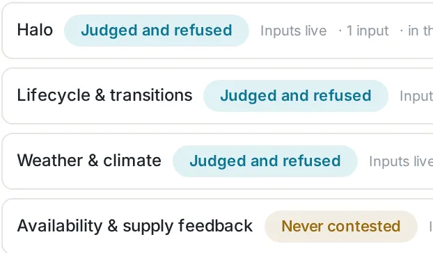
We ran that test on a demo world with real weather for three regions loaded through the connector plane, with no rejects. The paired champion score moved from 0.5093 to 0.5104, and weather was named on 0 of 2,310 series. That world’s demand had been generated without weather, so the correct answer was no, and the platform said no, with the score beside it, rather than drawing a weather line anyway. The refusal is the asset.
A contest for every series
The workbench’s second tab is the model contest.
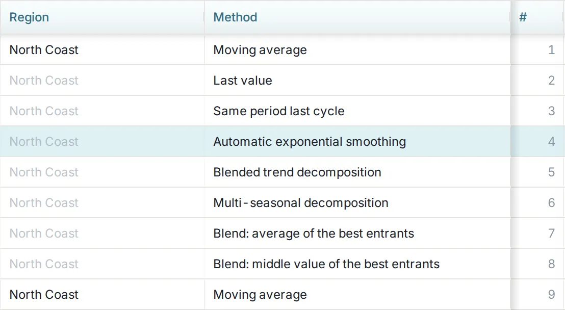
Simple rules, classical statistics, intermittent-demand methods and machine learning are put in front of each series’ own history, and every entrant is scored by the one accuracy definition the rest of the product uses. The winner is named on the grid with the margin it won by; the scoreboard shows every challenger; and the ranges, P10, P50, P90, come from the model that won, not from a rule of thumb applied afterwards. A full-portfolio run on a demo tenant classified 36,220 series, judged 31,151 of them, and published 800,000 forecast cells in 108.9 minutes as a governed job, skipping 1,090 series honestly and refusing none. We quote the throughput; that run’s accuracy is a demo world’s, not a claim.
Then the plan hears you
That is the whole screen: a worklist that says why, a verdict that is data, a number that explains itself, a driver that may be refused, and a contest that names its winner. Everything behind it is a policy with a switch, set at whatever level you choose. If you would like to see it on your own history rather than ours, that is the one thing we ask for.